Discover Our Brand
While many destinations update their brand image to reach new audiences or increase their visibility, this new branding aligns with an already-established, continued strategy of sustainable tourism.
It confirms the vision and the mission of the association, outlined more than 20 years ago—a vision with sustainable development at its core, and a mission where touristic development is encouraged to happen in harmony with the environment and its residents, ensuring visitors an authentic experience of the highest quality.
At its heart, it remains a collective promise we make to visitors. It can only be fulfilled if all parties involved (local businesses, socioeconomic partners, and residents) make this identity their own and commit to the continuation of the warm welcome Les Îles are known to offer. The tourism industry contributes positively to the quality of life in the region and its vitality, benefiting everyone.
Let us tell you who we are, what makes us Madelinots.
Let us introduce you to our greatest treasure, Les Îles.
This is us, we are Les Îles, this
enchanting destination in the heart
of the Saint Lawrence Gulf,
this waking dream so many
hope to experience one day.
We've been called beautiful and impressive,
our character and nature unmatched,
our residents' personalities like no others.
All who have met us and came to know us
will tell you how nothing compares;
What we have here cannot be found
anywhere else in Québec.
We are Les Îles, a destination favouring
the bold and the brave. A visit here
has to be planned, to be earned.
We are no detour, no passing scenery;
we are where we meant to be.
We are Les Îles, a place that can't be
described but can be lived. A visit here
will awaken all your senses. Sights, aromas,
flavours, melodies—all within your grasp.
We are Les Îles, a proactive and innovating
region with a respect for nature as
a foundation for our everyday lives.
Everything we work toward is planned
with the sustainability of the destination
in mind. We ask visitors to acknowledge
and embrace these values,
and to care for Les Îles alongside us.
A visit here opens the door to
new adventures,
new perspectives,
serene moments
of human connection and freedom.
We are Les Îles, we are unique.
We are independent.
We have our own ecosystem.
Our geographical position allows us
to live to our own rhythm, following
the seasons, nature, and the sea
that surrounds us. This way of life
is both an art and a part of our identity.
And we are ready to share it with you.
In all simplicity.
With great sincerity.
Because in Les Îles,
we don't pretend.
We stay true, at all times,
to our roots,
our stories,
our culture,
our home.
We know who we are.
We embrace all of it.
And we promise all visitors
to welcome them with open arms,
to have them live Les Îles to the fullest.

Discover Our New Visual Identity
Distinctive Features

The Anatomy of Our Logo: When Simplicity Tells a Story
Our logo is made of four key elements, combined in a cohesive and evocative representation of Les Îles.
The design follows the silhouette and inclination of our archipelago; the ellipse brings to mind harmonious collaboration with the environment and sustainability; the bands linking the words Tourisme and de la evoke the sand dunes which connect the many islands Les Îles are made of; the personalized accents point to the uniqueness of the Madelinots' accents.


Identity Colours
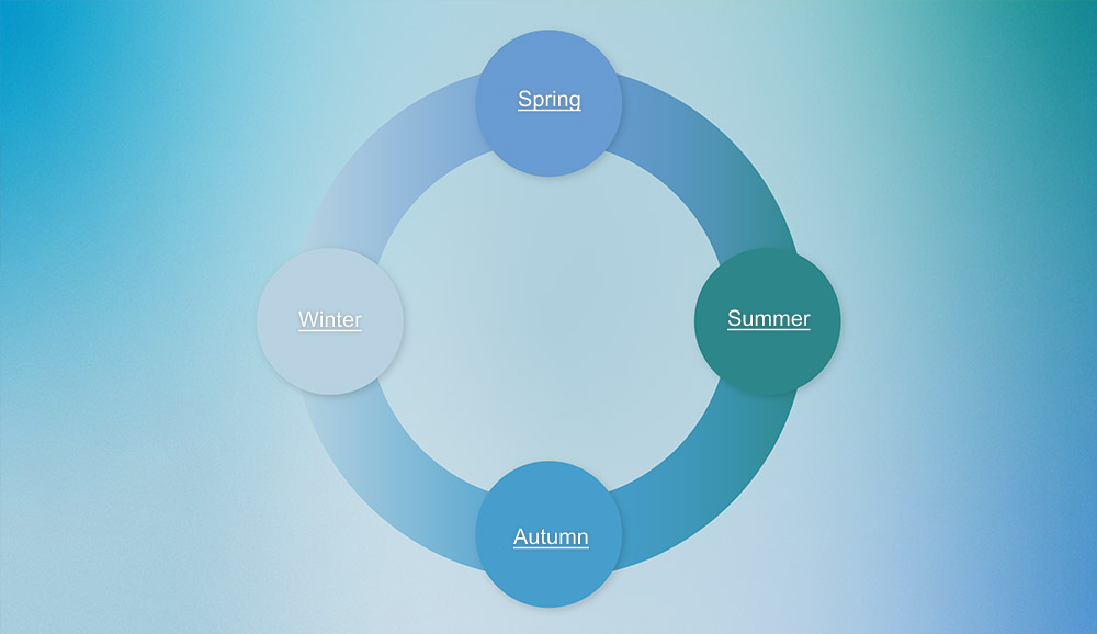
Our primary identity colour is blue. It shifts into four hues to represent the sea that surrounds us, season after season. We call it our living blue. Each shade of blue draws from the previous season, illustrating how our destination's seascapes evolve through the year.


Complementary Colours
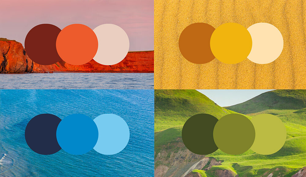
Our secondary colour palette draws inspiration from Les Îles' nature, pulling from the cliffs, the sand, the sea, and the hills. Each colour comes in a gradient of three shades—light, medium, and dark—to allow for varied compositions while hinting at the seasonal changes in light.


Graphic Shapes
Inspired by the nature surrounding us, our brand's visual universe includes graphic elements in a simple and abstract style. Some of these shapes are a nod to our former logo. Could you tell?


Typography
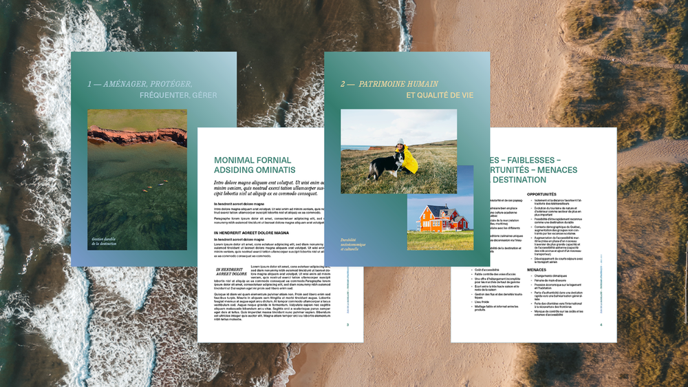
Our identity typefaces have been selected to evoke the warm and welcoming nature of Les Îles' residents. The contours and serifs mirror the natural curves of our archipelago, our sand dunes, and our cliffs.

